sarami
service
packaging design
visual identity
2026
Sarami is a Korean skincare brand that offers a simple routine, without the fuss and complexity of too many steps. Every formula is crafted with natural, plant- and fruit-based ingredients, bringing gentle, effective care straight from nature. Inspired by the philosophy of “less is more,” Sarami focuses on restoring the skin’s balance and radiance with clean, mindful formulations, so your beauty ritual becomes effortless, nourishing, and truly sustainable.
01
target
02
goals
03
keywords


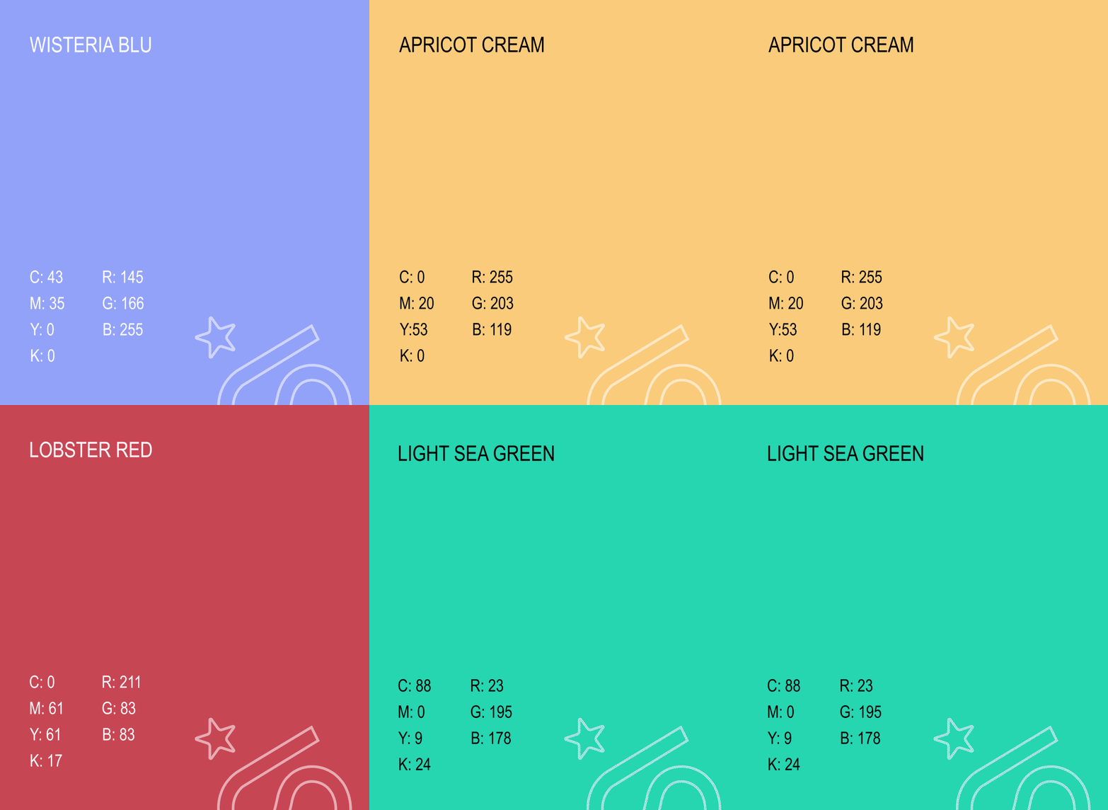
The brand's palette features bright shades that aim to convey a playful, more approachable experience with the products. Every color represents a brick that will complete the game with each product of the routine. The palette is balanced between 2 warm shades: Apricot Cream and Lobster Red, and cool ones: Wisteria Blu and Light Sea Green.
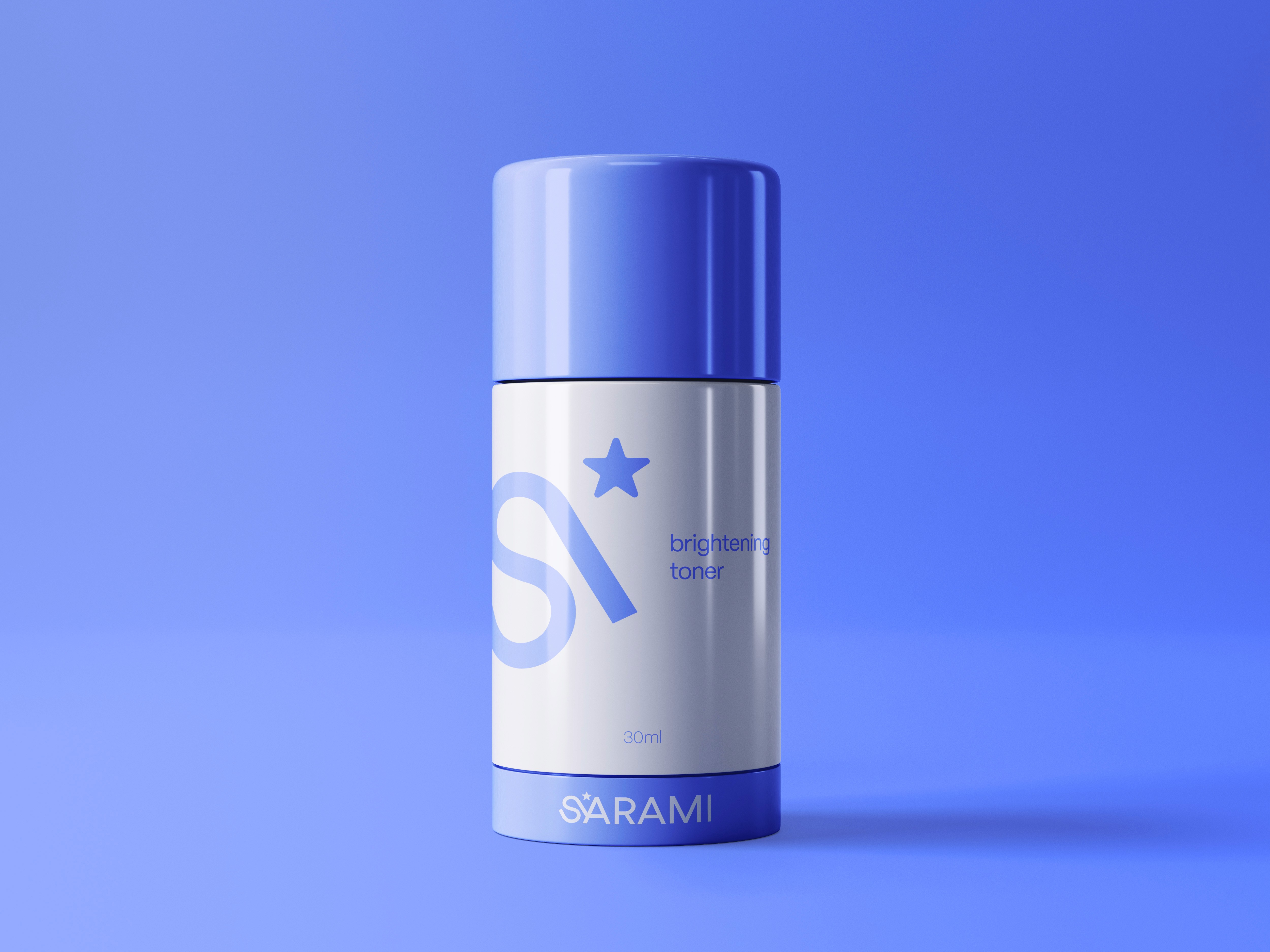
The brand was conceived as a game: a game that can be completed with all its pieces, each represented by a product. The product packaging features a simple and not overly elaborate design, reflecting the simplicity of the brand itself. The typography is intentionally simple and clear, so as not to appear confusing to those using the products.
Sarami’s routine consists of three products, chosen not at random but based on the skin’s needs and on what is sufficient to create a simple and effective routine. A toner, essential for balancing the skin’s pH and allowing subsequent products to absorb more effectively. Then an eye cream, useful for maintaining hydration in the area, which, being delicate, tends to dry out easily. Finally, a face cream to maintain hydration and protect the skin barrier from external agents.
THE PROCESS

The brand's palette features bright shades that aim to convey a playful, more approachable experience with the products. Every color represents a brick that will complete the game with each product of the routine. The palette is balanced between 2 warm shades: Apricot Cream and Lobster Red, and cool ones: Wisteria Blu and Light Sea Green.


THE PROCESS
The brand was conceived as a game: a game that can be completed with all its pieces, each represented by a product. The product packaging features a simple and not overly elaborate design, reflecting the simplicity of the brand itself. The typography is intentionally simple and clear, so as not to appear confusing to those using the products.
Sarami’s routine consists of three products, chosen not at random but based on the skin’s needs and on what is sufficient to create a simple and effective routine. A toner, essential for balancing the skin’s pH and allowing subsequent products to absorb more effectively. Then an eye cream, useful for maintaining hydration in the area, which, being delicate, tends to dry out easily. Finally, a face cream to maintain hydration and protect the skin barrier from external agents.

SARAMI
YEAR
2026
SERVICES
PACKAGING DESIGN
VISUAL IDENTITY
Sarami is a Korean skincare brand that offers a simple routine, without the fuss and complexity of too many steps. Every formula is crafted with natural, plant- and fruit-based ingredients, bringing gentle, effective care straight from nature. Inspired by the philosophy of “less is more,” Sarami focuses on restoring the skin’s balance and radiance with clean, mindful formulations, so your beauty ritual becomes effortless, nourishing, and truly sustainable.